Payment Method Discoverability - Amazon
Payment Method Discovery Across the Shopping Journey
Problem Statement
Customers weren't abandoning checkout because instalments were unavailable. They were abandoning because they didn't know they existed. Flexible payment options on Amazon MENA were invisible until checkout — by which point most customers had already decided to leave.
In one of the fastest-growing markets for instalment payments, customers couldn't discover or evaluate flexible payment options until the final checkout step — far too late to influence their purchase decision. Affordability signals were absent at Search, the Product Detail Page, Add-to-Cart confirmation, and Cart: the four moments where purchase intent is actually formed. Options like instalments and bank-linked offers existed, but without surfacing them earlier, they had no effect on conversion.
This led to the Instalment & Payment Discovery initiative: a redesign of how payment methods are surfaced across key pre-checkout touchpoints — Search, PDP, Add-to-Cart confirmation, and Cart. The goal was not just visibility, but delivering contextual, personalised, and timely affordability cues at the moments that shape whether a customer buys at all.
Identifying when customers need payment information
Before designing any screen, I worked out where in the journey payment information actually changes a decision. Purchase intent forms at Search, the Product Detail Page, Add-to-Cart confirmation and Cart, yet payment options only appeared at checkout. The next three sections cover the market opportunity, the customer pain points, and the design strategy that followed from them.
Opportunity
The MENA region is a uniquely high-opportunity market for payment innovation. Instalment adoption in the UAE alone grew 65% year-on-year through 2023–24, with providers like Tabby and Tamara acquiring millions of users. Yet Amazon's payment discovery experience had not kept pace with this behavioural shift.
The data told a clear story: customers who encountered instalment options before checkout were 2.4× more likely to complete a purchase using them. The challenge wasn't building a better checkout — it was redesigning discoverability for the entire pre-checkout journey.
Customer Pain Points
Through session recordings, funnel analysis, and 22 in-depth user interviews across UAE, Saudi Arabia, and Egypt, five structural pain points emerged — each compounding the others and collectively suppressing instalment adoption across the platform.
Design Approach
This was not a simple "show more information" project. It required a new design logic — one that knew when to show payment options, which options to prioritise for each customer, and how to present them without disrupting the primary shopping intent.
I established three design principles to prevent payment discovery from becoming another layer of checkout complexity.
Connecting Search, Product Detail, Cart, and Checkout
Based on the four-touchpoint pain-point analysis, I designed a connected payment discovery system that carries instalments and bank offers through the entire pre-checkout journey — Search, PDP, Add-to-Cart confirmation (HUC), and View Cart — rather than treating each page as a separate redesign.
I built every solution on the same three principles from my design approach: progressive disclosure, personalised payment ranking, and zero primary-flow disruption. The same ranking logic powers each touchpoint, so the message stays consistent as customers move from browse to buy. Together, they turn payment from a checkout-only step into a conversion lever at the discovery stage.
Making complex payment options easier to understand
Instalment plans, bank offers, coupons and partner rules all compete for attention. At each touchpoint I reduced them to what a customer needs to decide at that moment, and made every signal ignorable so Add to Cart, Buy Now, and Proceed to Checkout kept their visual dominance.
Instalment & Payment Discovery
- Instalments at search level can lift click-through by 18–22%; monthly framing reduces price-anchoring friction
- Eligible products gained improved visibility and ranking based on payment signal quality
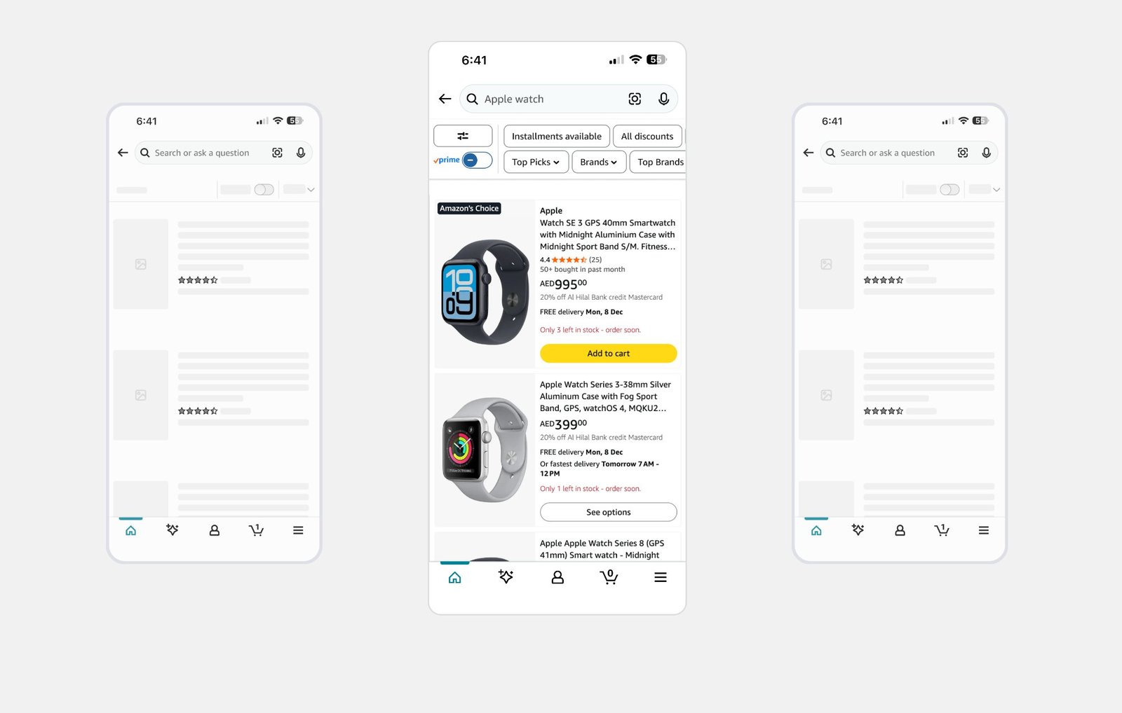
Before — no instalment or payment signal
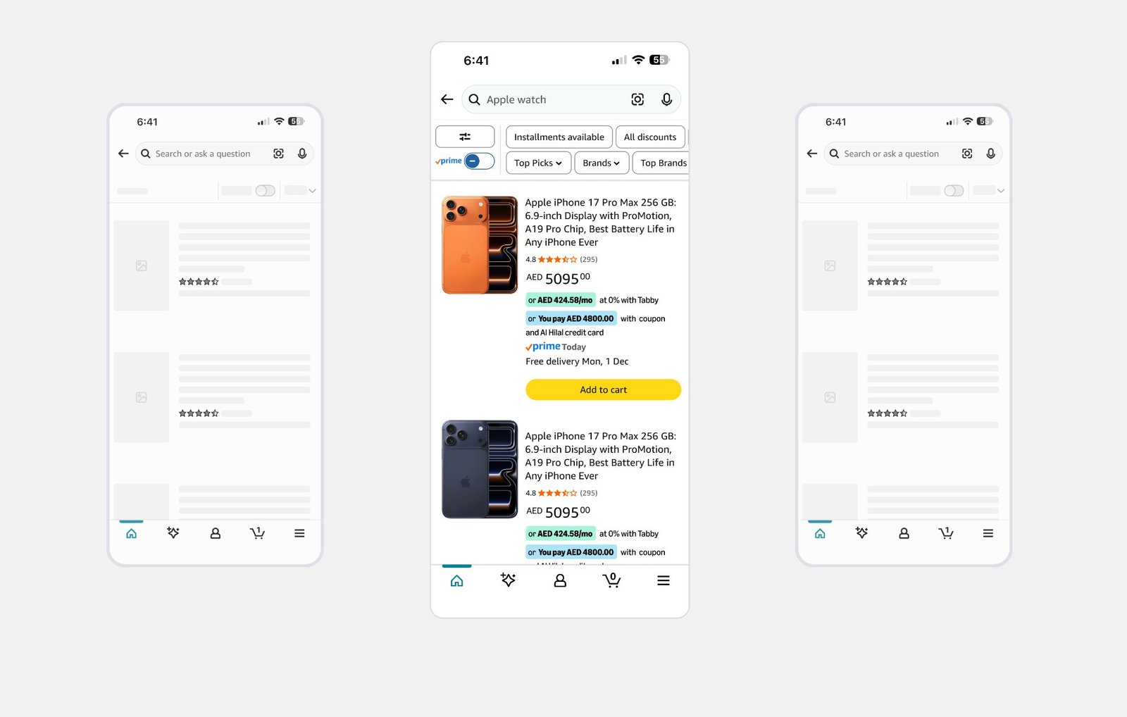
After — instalment & payment discovery
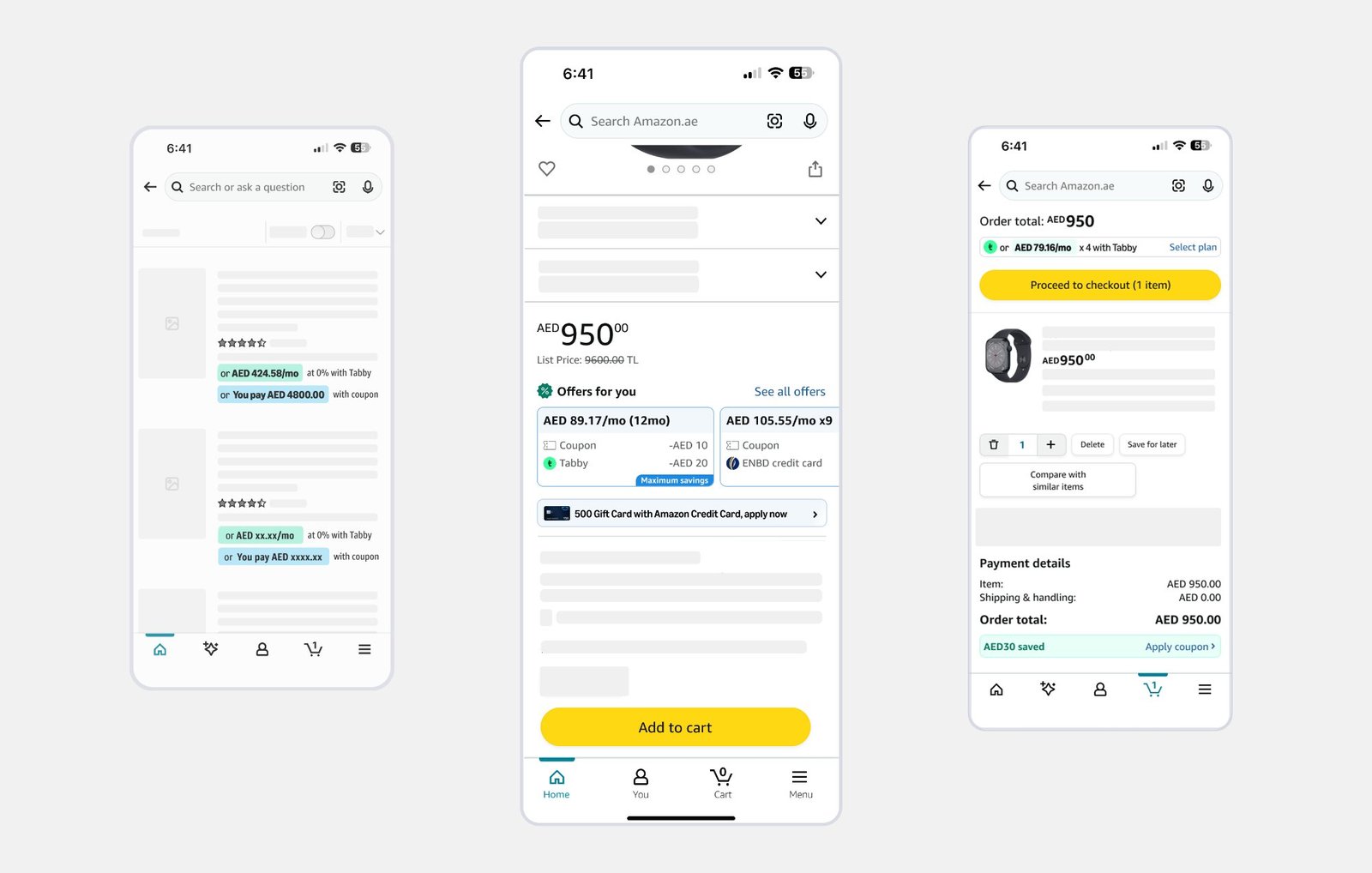
Offers & Instalment Discovery
- In A/B testing, surfacing “AED 89/mo” on the PDP reduced perceived price by 31% and lifted add-to-cart rate by 22% on items above AED 400
- Customers could combine offers to save up to 35%, previously invisible
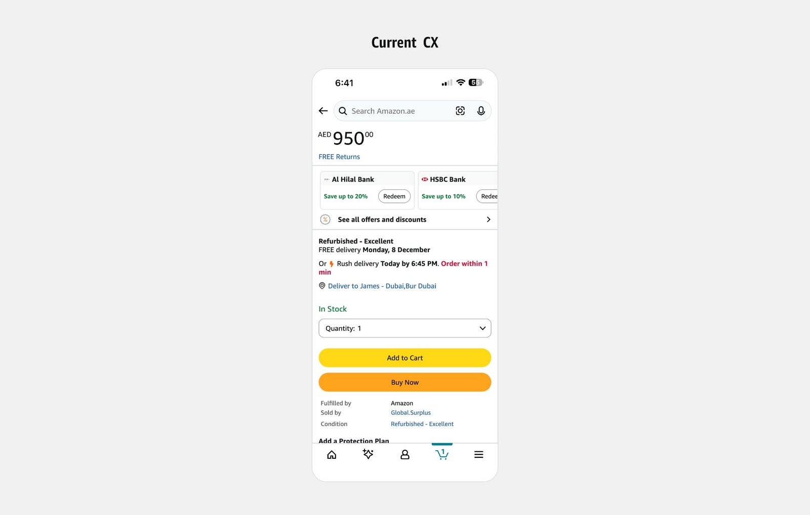
Before — payment buried below the fold
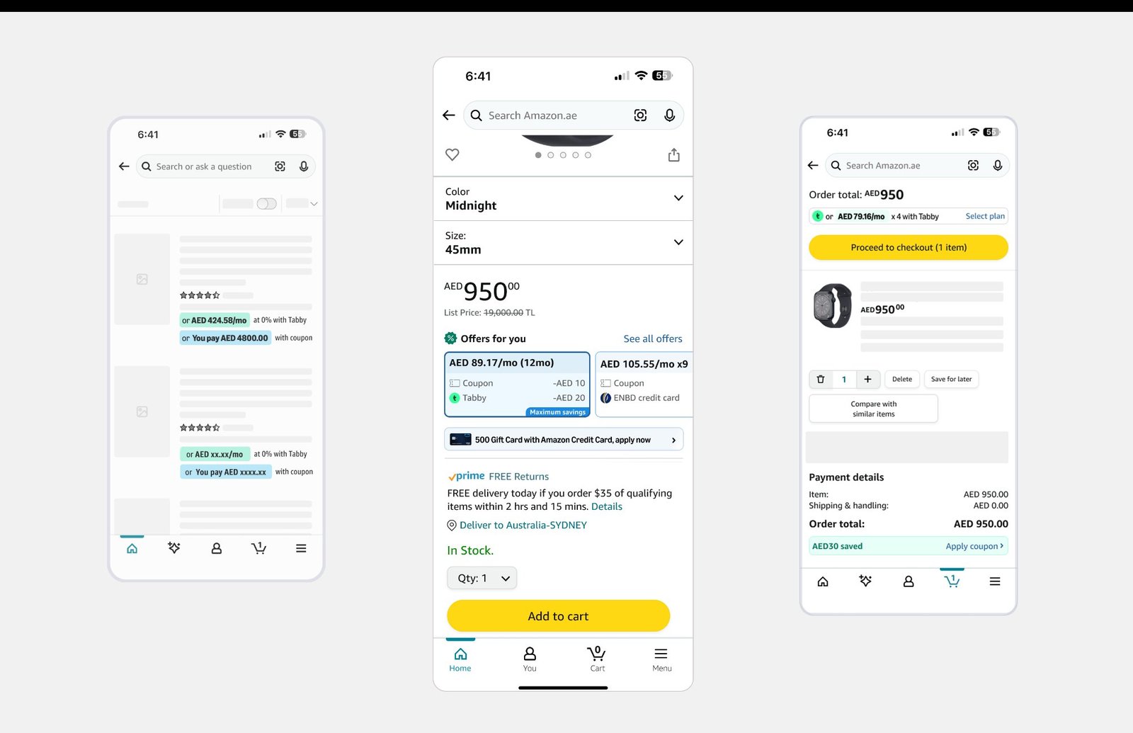
After — “Offers for you” row
Reachable Offers & Instalments
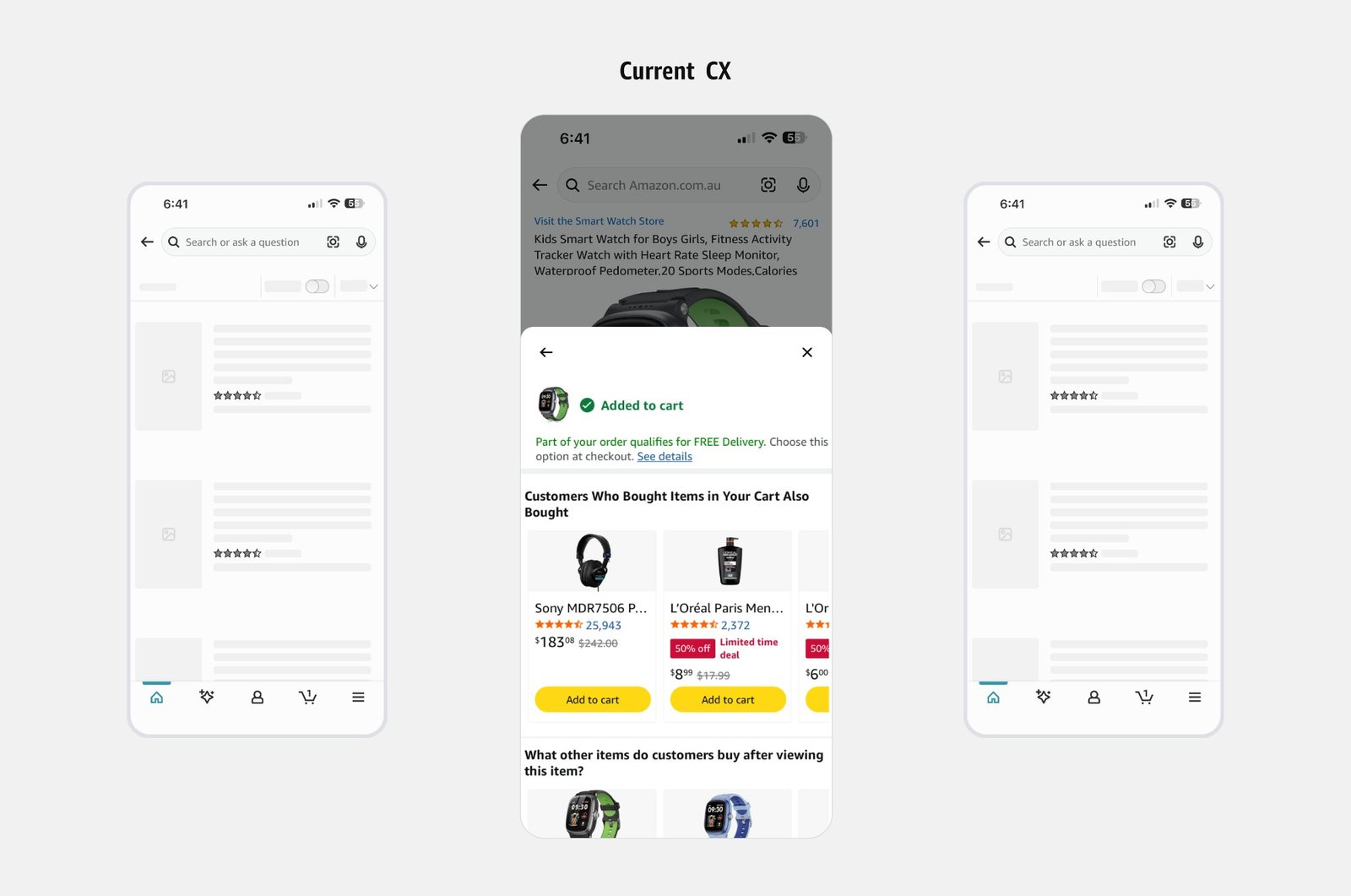
Before — no reachable-offer or instalment visibility at Add-to-Cart
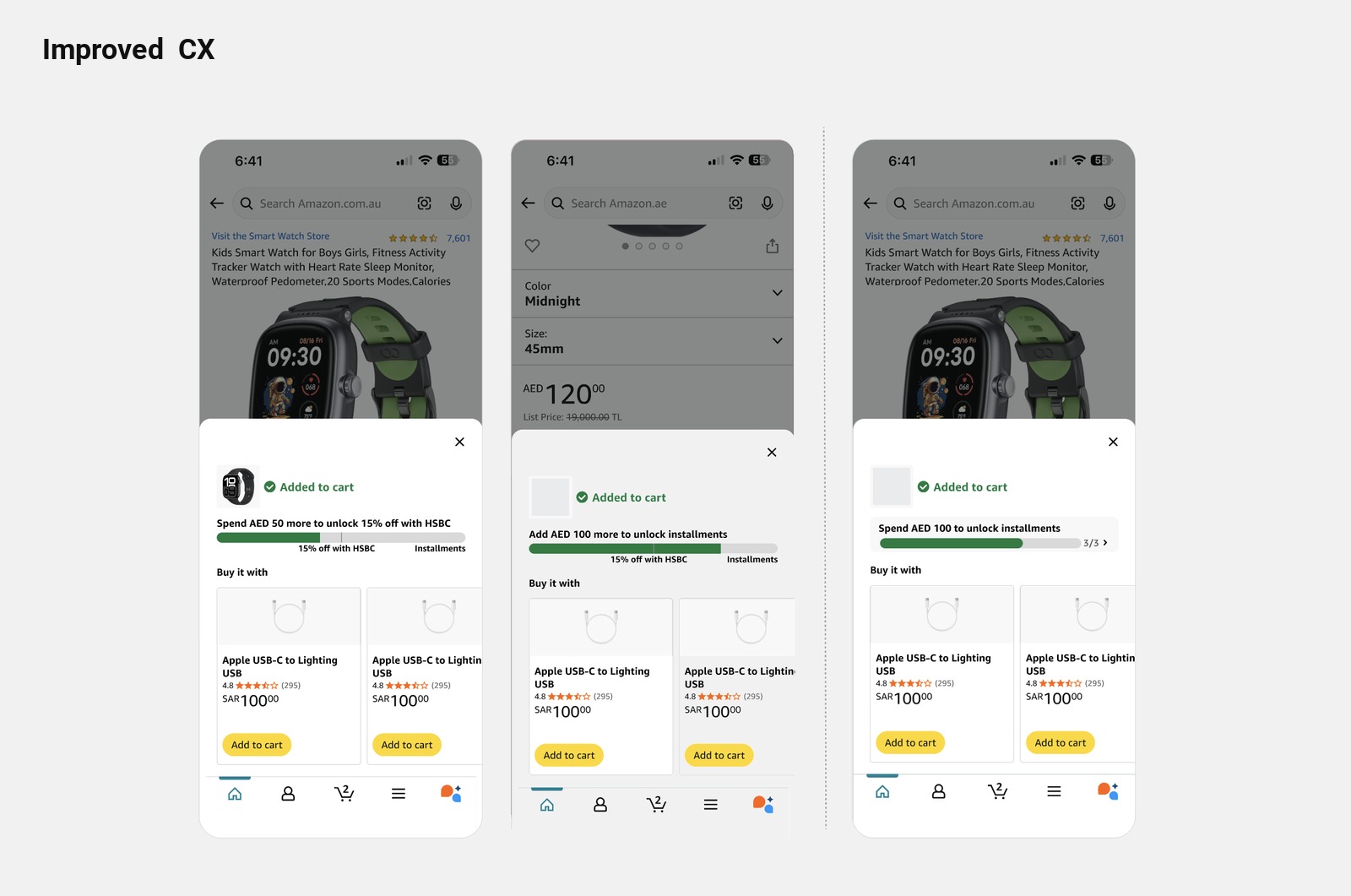
After — reachable offers & instalment prompts at Add-to-Cart
Payment & Instalment Discovery
“I had no idea I could pay in four. I just saw the total and thought — that's a lot. If it said I could pay AED 237 today, I would have done it right there.”
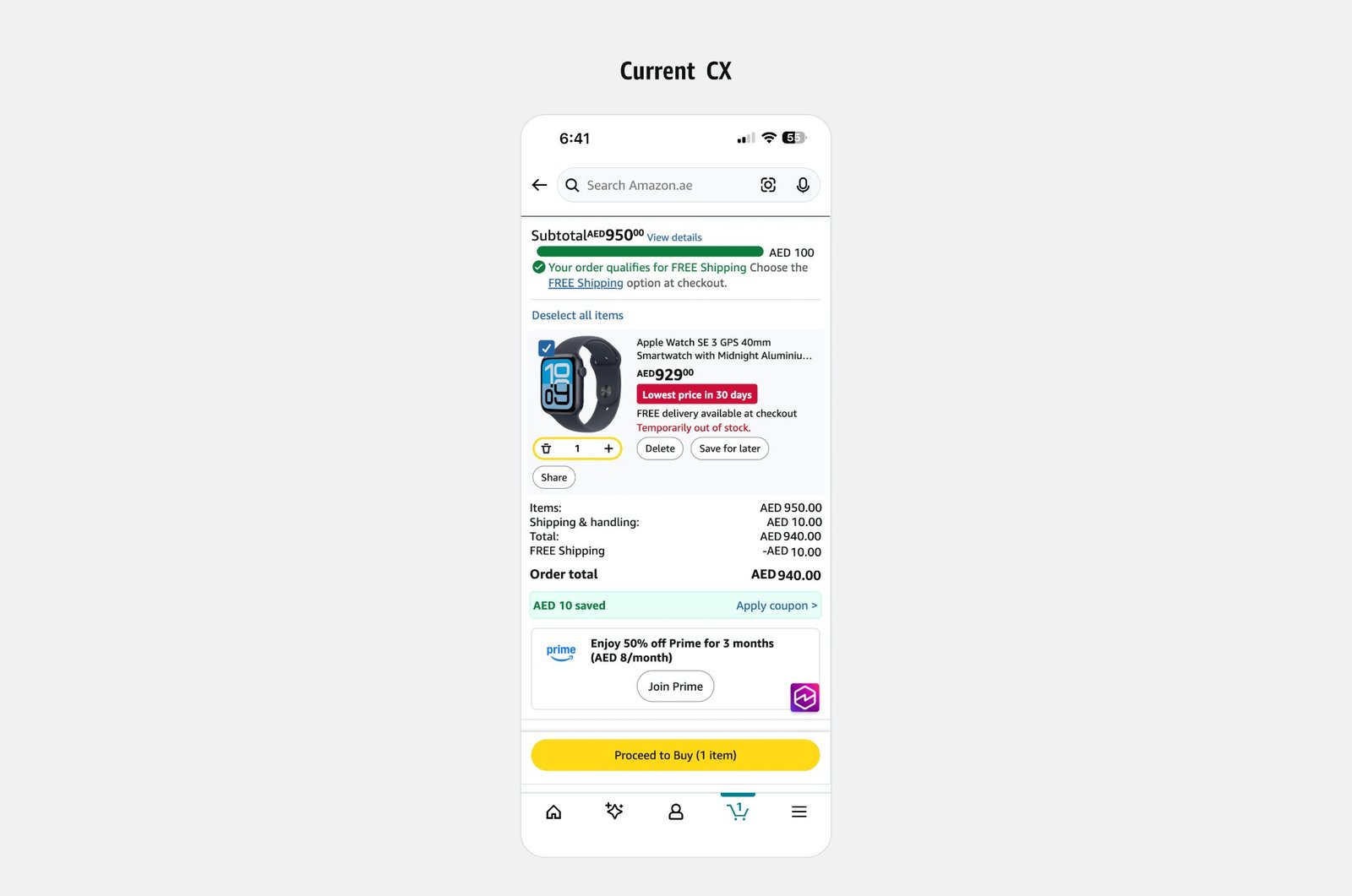
Before — no payment or instalment visibility
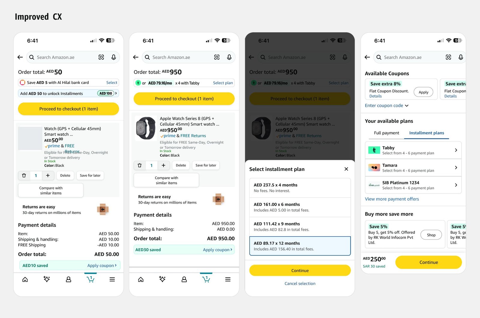
After — basket-building & instalment discovery
Creating reusable, accessible components
A multi-touchpoint system only holds together if it is built from shared parts. I extended the Amazon MENA design system with a component library, so Search, PDP, Add-to-Cart confirmation and View Cart share one visual and interaction language.
- Reusable payment components extending the Amazon MENA design system, used across all four touchpoints
- One ranking logic and one message pattern reused across Search, PDP, Add-to-Cart confirmation and Cart
- Annotated Figma specs and interaction documentation prepared for developer handoff
- Launched across all four touchpoints together, so the journey stays consistent
- The payment design system I advanced at Amazon includes 20+ reusable, WCAG-accessible components
Explaining the research, prototype testing, and evidence behind decisions
Each decision in this case study is tied to evidence: research before design, prototype and A/B testing before launch, and measured results after. Below: the evidence base, the prototype used for leadership alignment, and the launch results.
Prototype Walkthrough
An interactive prototype built for leadership alignment — demonstrating the end-to-end instalment discoverability experience across Search, PDP, and Checkout.
Results After Launch
The redesign launched across Search, PDP, Add-to-Cart confirmation and View Cart together. The results below come from the launched experience, backed by the research and testing described above.
Improving payment discoverability did not just lift conversion. It gave customers confidence earlier in the journey, so instalments became part of how they decided what to buy, not a late surprise at checkout.
What I led, and what the team and partners contributed
End-to-end ownership meant leading the design, research and handoff, while depending on product, engineering, legal and partners for what they own. This is where that line sits.
- Ran 22 moderated interviews and analysed 450K+ sessions to find the drop-off points
- Designed 3–4 layout variants per touchpoint and tested copy, placement and disclosure depth
- Led compliance reviews with Tabby, Tamara and the bank partners, and closed 140+ annotations from the tracker I maintained
- Led the six-week A/B testing phase across three UAE cohorts, Australia and Singapore
- Prepared handoff: annotated Figma specs, interaction documentation and the component library
- Built the interactive prototype used for leadership alignment
- Amazon MENA Product and Payments: aligned with me on the current-state map (14 touchpoints) and the shared success metrics
- Personalisation engineering: worked with me to define the ranking logic, including 12 edge cases
- Tabby, Tamara, Al Hilal, HSBC and ENBD: set brand, disclosure and eligibility constraints, and reviewed weekly Figma prototypes
- Legal and product experience review: signed off before launch
From Pain Points to a Shipped, Multi-Touchpoint System
Six months of cross-functional design work, spanning Amazon MENA product, payments, legal, and three external instalment partners.
Kicked off with cross-functional alignment across Amazon MENA Product, Payments, instalment partners (Tabby, Tamara), bank partners (Al Hilal, HSBC, ENBD) and legal — mapping the current-state experience across 14 touchpoints and defining shared success metrics. In parallel, I ran 22 moderated interviews across UAE, KSA and Egypt and analysed 450K+ sessions to pinpoint exact drop-off points; eye-tracking on PDP confirmed 60%+ of users never scroll past the Add to Cart button, validating an above-fold placement strategy.
Designed 3–4 layout variants per touchpoint — testing copy framing (monthly amount vs partner branding), placement logic (inline vs overlay) and disclosure depth — reviewed with partners via weekly Figma prototype cadences. In parallel, worked with the personalisation engineering team to define the ranking logic behind payment surfacing: lowest monthly payment → linked offers → recently used methods → co-branded card upsell, covering 12 edge cases including ineligible products, cart thresholds and failed authorisations.
Led rounds of compliance review with Tabby, Tamara and bank stakeholders, resolving constraints on logo usage, interest disclosures, eligibility messaging and co-branding hierarchy. Maintained a centralised compliance tracker, closing 140+ annotations ahead of launch readiness.
I treated payment discoverability as a potentially global customer problem rather than assuming it was unique to MENA. I used cross-market learning to evaluate the underlying customer need, looking at how it shows up across countries, payment ecosystems and shopping behaviours, while accounting for differences in payment-provider availability, customer eligibility, local regulations and purchasing behaviour. This helped me distinguish reusable design principles from market-specific implementation decisions.
As the design evolved, I led a six-week A/B testing phase across three UAE cohorts, Australia and Singapore, comparing the proposed experience against the existing approach. It gave a structured way to assess whether surfacing instalment information earlier in the shopping journey could improve discoverability and influence customer decisions.
I then prepared the handoff, with annotated Figma specs, interaction documentation and a component library extending the Amazon MENA design system. The experience launched across Search, PDP, View Cart and Add-to-Cart Confirmation together to keep the journey consistent, with full product experience sign-off obtained beforehand. Combining problem discovery, cross-market learning, iterative design and validation produced an experience that meets local customer needs while supporting a more scalable approach to payment discovery.